The History of the British Pub Sign: Why Pubs Are Named After Kings, Animals, and Odd Objects
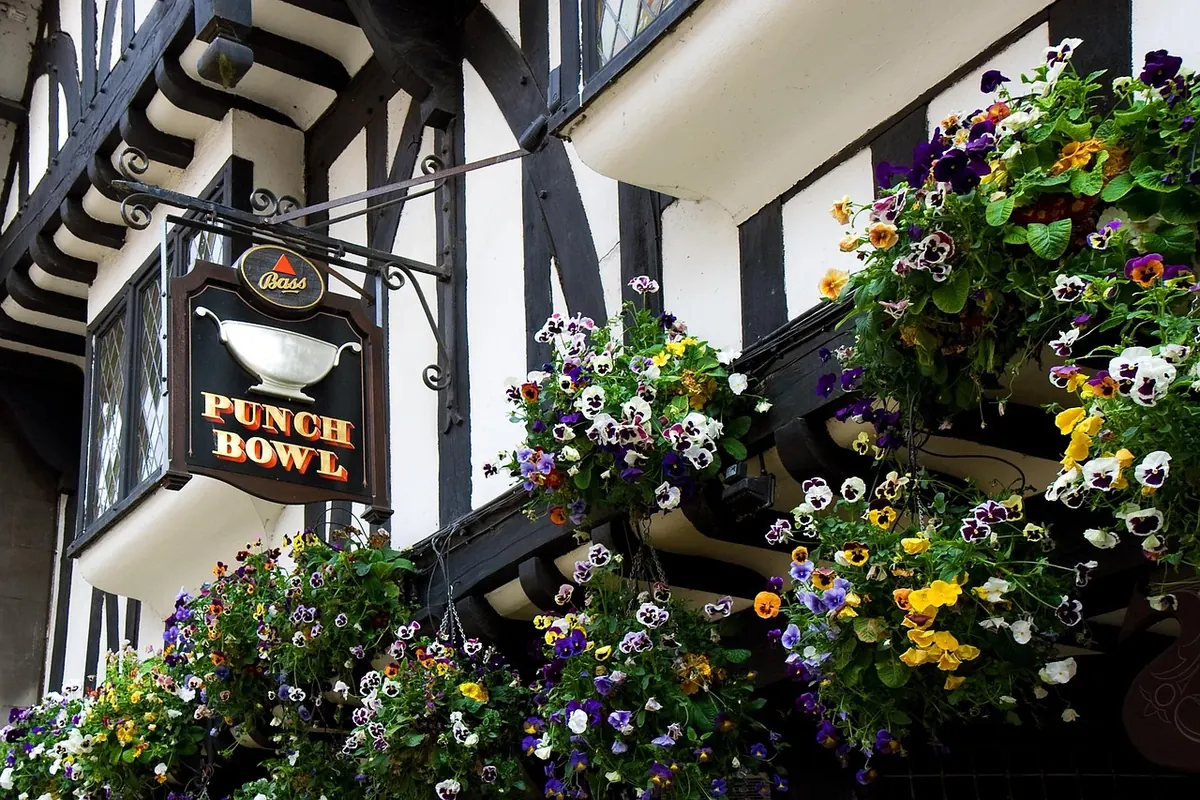
Walk down any high street in Britain and you can read the country's history in painted wood. A swan here, a crown there, a coach and horses, a goat and compasses, a bucket of nails. Pub names are strange, funny and often centuries old, and the signs that carry them were never decorative afterthoughts. They were directions, advertisements and legal proof of identity rolled into one board of timber and pigment.
The story of the British pub sign is really a story about a mostly non-reading public, a government that wanted to tax beer, and landlords who needed to be found. Add a few hundred years of weather, repainting, brewery buyouts and local pride, and you get the odd, wonderful collection of names still hanging above doorways today.
Long before lettering, drinking places were marked by objects. A pole with a bunch of ale-soaked foliage on top — an ale-stake or bush — told travellers that beer was available inside. In 1393, a law of Richard II required inns and alehouses to hang out a sign so that customers, and the official ale-taster who checked quality and price, could identify them. The requirement was practical: a town needed to know where ale was sold and who was selling it.
Once a sign was compulsory, it had to be recognisable. That favoured pictures over words, and it favoured symbols that could be seen from a distance and copied by a local painter with limited skills. A cross, a bell, a crown or an animal worked because almost anyone could identify it, whether or not they could read the name underneath.
For most of the pub's history, literacy was the exception rather than the rule. A sign that said "The Red Lion" in tidy script was useless to a carter who could not read a word of it. A sign showing a red lion rearing on a white background was a different matter entirely. Colour, shape and silhouette did the work that letters could not.
This is why so many traditional pub names are visual, concrete and slightly absurd:
The Goat and Compasses is a useful example of how names drift. It is often explained as a corruption of a Puritan phrase, "God encompasseth us", though the true origin is debated and may simply be a pair of common emblems combined. Either way, the result is the same: a name nobody would invent deliberately, kept alive because the sign was already there.
Royal names spread for reasons that had little to do with loyalty and everything to do with convenience. When a monarch granted a licence to an innkeeper, or when an inn stood on land owned by a noble family, the sign might carry the family's badge. The White Hart was the emblem of Richard II; the Red Lion appears in the arms of several noble houses, including the John of Gaunt connection that made it common across England. The crown itself became a near-universal shorthand for official approval.
The consequence is that certain names are everywhere. If you travel across England, you will pass a startling number of Red Lions and White Harts, and rather fewer unusual names. That repetition is not laziness. It reflects centuries of signs copied from neighbours, brewery branding, and the simple fact that a lion or a crown was easier to paint than a unique device.
Before street numbers and reliable maps, the sign was the address. Letters were sent to "the sign of the Bell, in Fleet Street" rather than to a numbered door. Coaches stopped at named inns. A publican's sign was as much a piece of infrastructure as the road outside, and it had to be distinctive enough that a stranger could find it after being told the name once.
Over time the painted board became something more than a marker. Inns commissioned carved and gilded signs, some with ironwork brackets that are now prized in their own right. The sign hung over the pavement, often on a bracket, and the space beneath it gave the pub a patch of street it could claim.
Attitudes shifted in the twentieth century. As roads widened and traffic grew, oversize signs became a hazard, and some councils restricted them. At the same time, planners and conservationists began to see the sign as part of a building's character rather than a removable advertisement. Today, a pub sign on a listed building may need listed building consent to alter or replace, and many councils treat the sign and its bracket as part of the street's historic fabric.
Practical points worth knowing if you own or care for an old sign:
If you are dealing with a listed building, a conservation officer or a solicitor with planning experience can give you proper advice for your specific case. Rules vary between authorities.
Next time you stand outside a pub, look at the sign before you go in. The name may point to a saint, a battle, a trade, a family, a lost phrase or a joke that has survived for three hundred years. The painting may be a modern repaint, a tired Victorian board or a carved original that has weathered more governments than most of us can name.
A few things are worth doing if you want to get more out of pub signs:
The British pub sign is easy to ignore. It is also one of the few pieces of everyday commercial art that has been in continuous use for more than six hundred years, outlasting the ale-stake, the stagecoach and the letter addressed to a sign. Its survival depends on people noticing it — and on landlords, breweries and councils treating it as something worth keeping.
If you are researching a pub's name, start with the sign itself, then the building, then the local archive. Look for a date, a maker's mark or an iron bracket detail. Ask the staff and regulars; they often know which name the pub used before the last refurbishment. If you are planning to change, remove or restore a sign on a listed building, contact the local planning authority first and take advice from a conservation officer or a solicitor before work begins. And if you simply want to enjoy the tradition, choose a pub by its sign once in a while. It is still a reasonable way to find a good pint.
Previous Post
Seasonal Pub Events: What to Expect on Christmas Eve, New Year's Eve, and Bank Holidays
Next Post
Why Old Pubs Have Two Bars: A History of Public and Lounge Bars